
The Gift That Keeps on Giving
The Gift That Keeps on Giving
Irrational investors are quite entertaining, though sad.

If you are getting the email version of this piece, you may need to open the link to get the full immersive experience. The title is the gift that keeps on giving because I will be referencing Twitter which is filled with illogical investment claims and memes. All of these tweets are basically fuel for a bearish fire.

Here’s your entertainment to open things up.
These are your stock market bulls…
This guy is talking about his AMC and Gamestop shares while walking through a casino.

This guy thinks AMC will go to $100,000 ( which is a $51 trillion market cap.)

And here are the Island Boys on Tesla stock.

Some Real Analysis
First, let’s take a look at a chart which originally popped up on a piece on MarketWatch. The piece essentially predicts that a bubble is coming, but not already here. The strategist predicts that stocks will continue to climb from the current S&P 500 level of 4,660 to 6,750, or about 45% higher. The chart started showing up on Twitter yesterday. See if you can spot the chart crime.
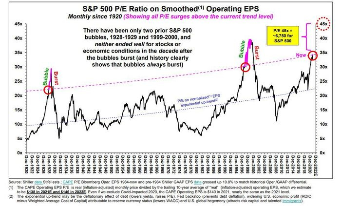
If you guessed that the chart crime is people are still using upward trend lines on a valuation chart, you are correct. P/E ratios should not be upward sloping. P/E is basically the inverse of earnings yield and higher P/E ratios essentially equate to lower earnings yield. An upward sloping P/E trend essentially shows that investors will be increasingly fine with accepting lower and lower yields. At some point, the lower expectations for earnings yield will cease, as investors will not accept a yield of 0.00001%, just as they would not accept a yield of 0.01% or even 0.5% for holding risk assets. Over time, expectations for P/E ratios should be flat and the long-term trend should be a horizontal flat line without slope.
The fallacy is short-term thinking. In the short-term, interest rates can go to zero. This impacts expectations for earnings yield and P/E. They cannot stay there indefinitely. We are about to see this first-hand.
Back in November, we saw a similar chart crime with the Market Cap to GDP chart. The overall issue here is investor psychology. To view the chart from the lens of a value investor means to view that we are already in a bubble and it may be too late to stop it from popping.
Suggesting that stocks can go up another 45% from here is tantamount to suggesting the Chicago Bears will win the Super Bowl with a 4-9 record. Statistically speaking, there’s a 1% chance of them making the playoffs.
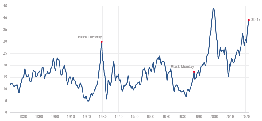
Elevated P/E ratios do have a remarkable ability to predict forward looking returns. Here’s a chart showing how strong this relationship can be with multiple data points using the CAPE ratio. CAPE is a modified version of P/E that adjusts for cycles. That’s similar to “smoothing” the earnings, as shown above.

Currently, the CAPE is 39.17, about 2.47 times the median of 15.86. The chart below shows this elevated level. The chart above shows that the expected 10-year returns for a CAPE of 39 are nearly a 0% return. That’s over a 10-year period. Essentially, history shows us that this level of elevated CAPE creates a market with returns that have been pulled forward for 10 years.
Now, we all know that markets don’t trade flat. They go up and down.
Another data point to review on valuation is the inflation adjusted earnings yield. It should be noted that earnings yield is the opposite of P/E. So, the chart below is almost a mirror image to the CAPE above. However, this chart includes an adjustment for inflation.

You can see four points in time noted on the chart, starting with the 1970s bear market that corresponded to above average inflation. You will also see the DotCom Bubble and Global Financial Crisis. Note that there are four times where the inflation-adjusted earnings yield dipped below 0. Three out of the four correspond to periods of negative equity market performance and the fourth time is now.
Investors shouldn’t be expecting 10% corrections. They should be expecting 70% corrections. It’s not market manipulation. It’s greed and a failure to do research or understand what you are buying.