Chart Crimes and This Crazy Bubble
A CHART CRIME
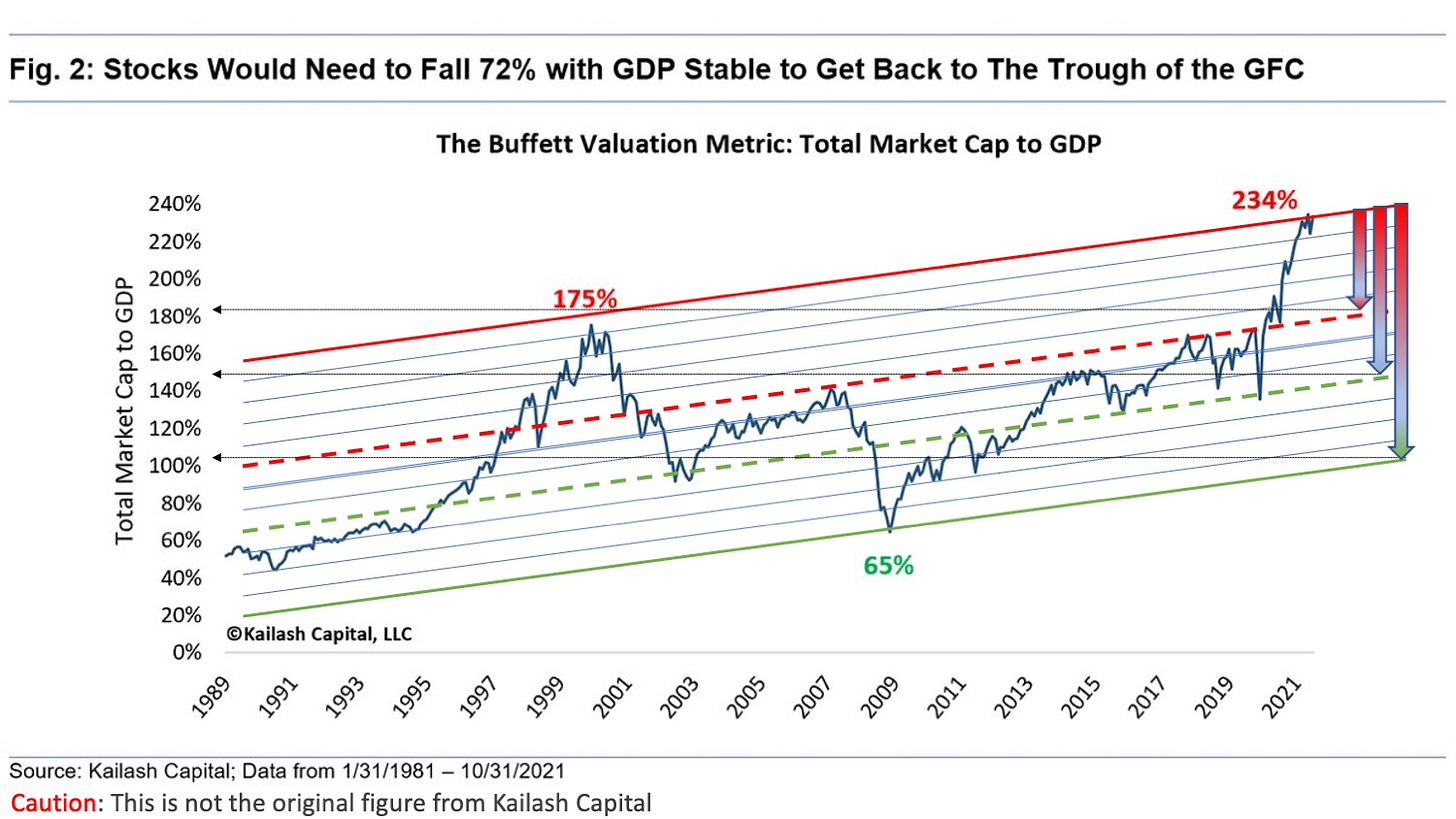
Recently, as I was scrolling through Twitter, I witnessed a chart crime. Here it is. See if you can spot the problem.
If you guessed that the crime is the trend lines are slanted upward then you are correct. This is a chart showing Market Cap to GDP. This chart is meant to be viewed over a long period of time and it shows equity market values as compared to GDP. GDP is constantly growing and therefore the denominator of the ratio is ever growing. In relative terms, total market cap should grow at reasonably the same pace.
BUT, you ask, “Shouldn’t stocks return 10% while GDP grows at 2% over the long-term?”
Theoretically, stocks will out-return the growth in GDP. Some of that growth will be driven by leverage and stock buybacks. This is how a company can turn 2% sales growth into 10% return for shareholders. There is also mergers and acquisition activity that consolidates companies and companies that fail.
In the grand scheme, if market cap growth outpaces GDP growth, then you have a stock market that is ahead of the economy. I am going to admit that this perplexes me a bit and I will probably do more research into the factors that affect this relationship, driving stock prices higher than GDP growth.
The bottom line is that the relationship, as shown in a trend line, should be a perfectly horizontal line. Here’s an unaltered version of the chart.1
Notice that the mean value, when looking at the Wilshire 5000, is somewhere around 85%. You might notice that during periods of high inflation and high interest rates, the overall market tended to trade below the line. During periods of Zero Interest Rate Policy, the valuation metric trades at lofty values.
How do we know this chart is valuable?
We can take Warren Buffett’s word for it, or alternatively we can also back-test it.
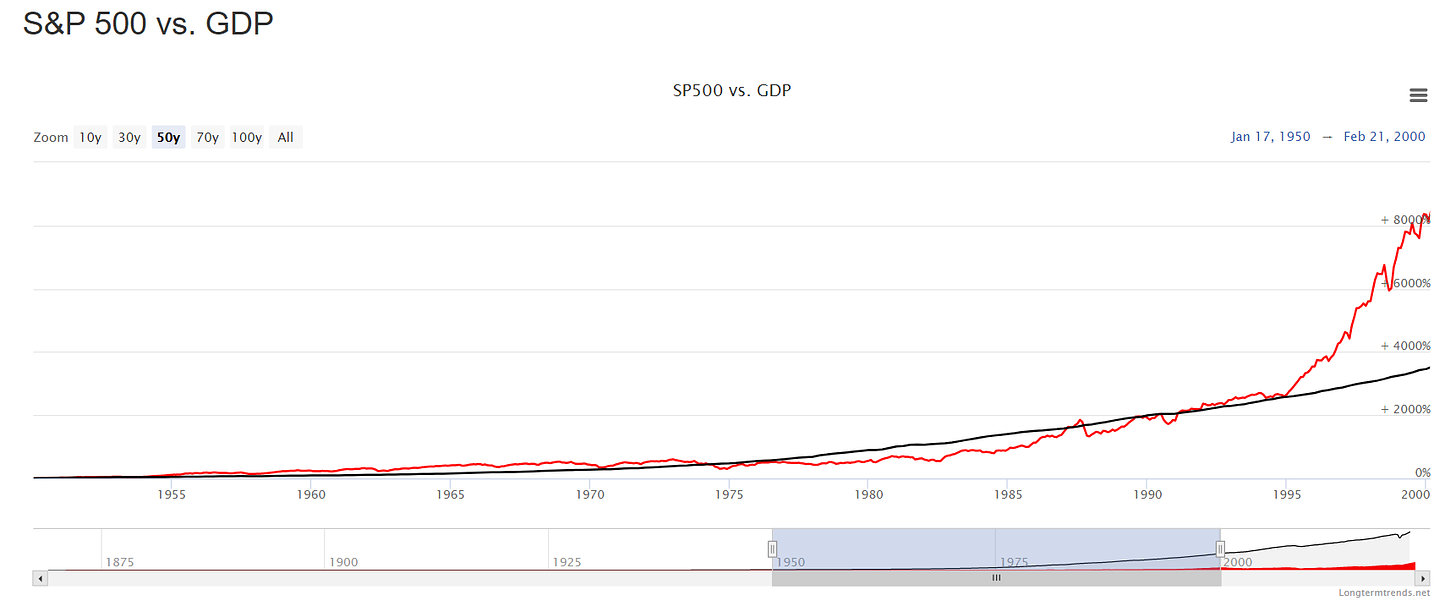
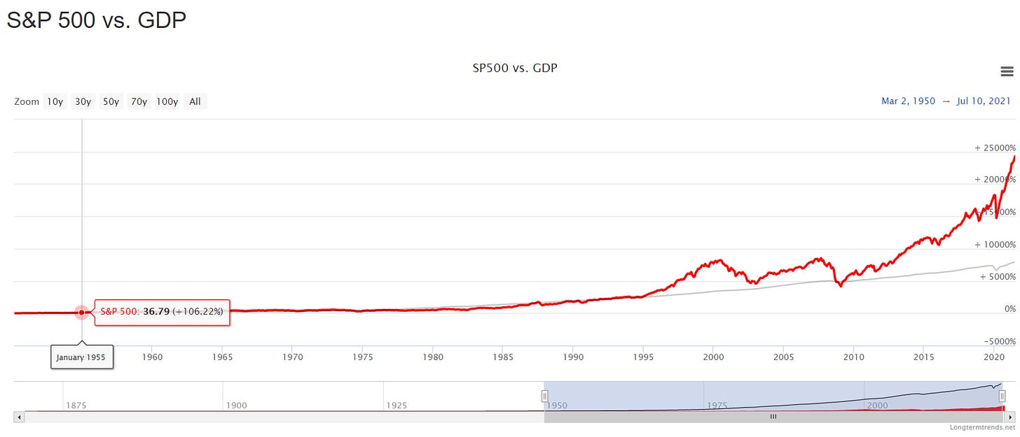
Here’s the chart showing S&P 500 vs. GDP.
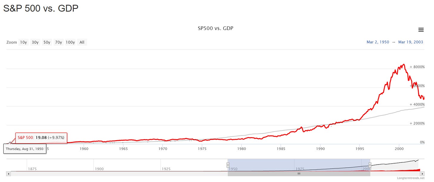
This would be the period ending at the height of the dotcom bubble, which in the rear view mirror of life is easy to say was an equity market bubble. If we simply extend the graph to the right by about 3 years, we can see that the market dropped to revert to the trend line of GDP.
It didn’t drop all the way because one of the policy responses to this recession was to lower interest rates. This artificially supported equity prices.
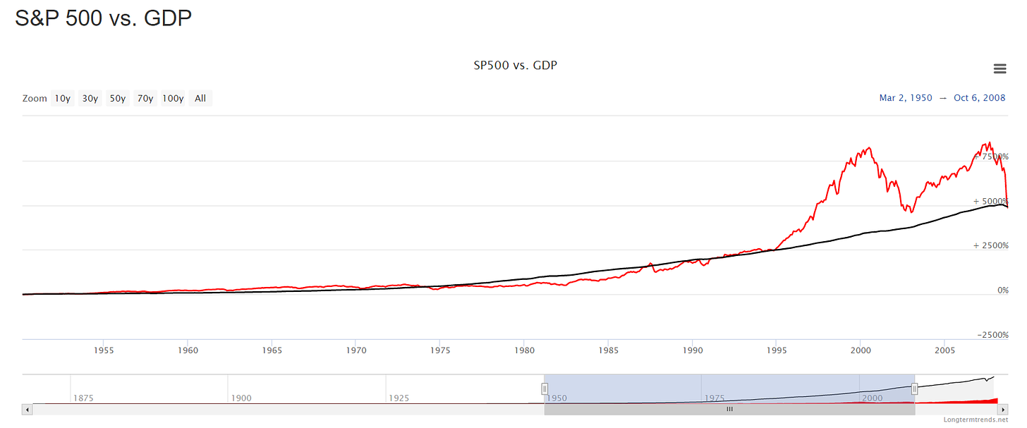
During the subsequent years, the bubble reinflated, but again an equity market correction pushed prices back towards the trend line.
The financial crisis of 2008 lead to further Keynesian economic stimulus, lower rates, and quantitative easing. As a result, the trend and normal stock valuations are largely forgotten at this point, over ten years later.
If you have made it this far, you might be one of those people saying this time is different. You might also say maybe stocks have reached a permanently high plateau.
Maybe so. Maybe all the great value investors are wrong, but I don’t think so.
The YOLO FOMO MOMO Trade
If you are like the majority of investors watching your index funds return solidly and hit new highs recently, this next fact will be a surprise. Stock market breadth has been abysmal recently. There are some days when the majority of stocks are actually trading down, while indices actually move higher.
Howard Marks makes a comparison of the stock market to a pendulum.2 The mood of investors and the returns in the market swing from pessimistic to optimistic and from below mean to above. Rarely does the market actually return an “average” return.
This reminds me of a distant memory. As a teenager, I once watched a drunk adult chug a beer, grab a rope swing and pull it far back over the heights of the James River. He took a few steps, leapt from the river bank holding the rope, and collided face first into the thickness of an oak tree’s trunk. He was knocked unconscious. He was living his best life and had the best of intentions, but wasn’t in control.
The story of the drunk rope swinger reminds me of the YOLO FOMO MOMO trade. Let me describe this trade with charts.
Market Breadth
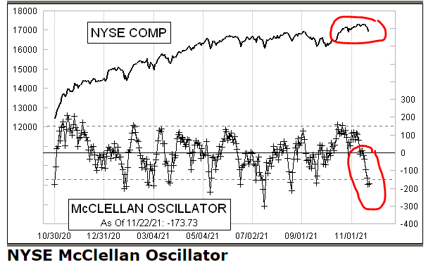
As measured by the McClellan Oscillator, most stock returns are turning sour, at least in the short-run, while markets hover near highs.
“Each tick mark represents one day’s reading of advances minus declines.” “When the Oscillator is positive, it generally portrays money coming into the market; conversely, when it is negative, it reflects money leaving the market.”3
Concentrated Gains
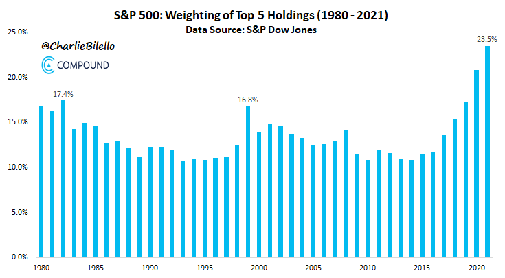
While market breadth continues to deteriorate, the weighting of the top stocks in the S&P 500 and Nasdaq goes higher. The indices are being propped up by the so-called FAANG names. Buying call options in these stocks has been the YOMO FOLO MOMO trade for the past few years.
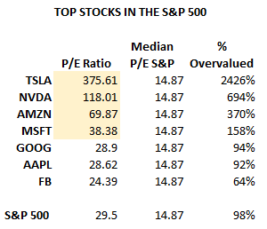
If you think this is a flight to quality, you are probably thinking the same as the people betting their lives on these stocks. However, these stocks are not cheap. Here’s a selected group of the top holdings in the indices.
Not only is the overall index still stretched in valuation above long-term median value of 14.874, the top holdings are leading the way in that over-valuation. Tesla, Nvidia, Microsoft, and Amazon could take at least a 50% drop and still be overvalued.
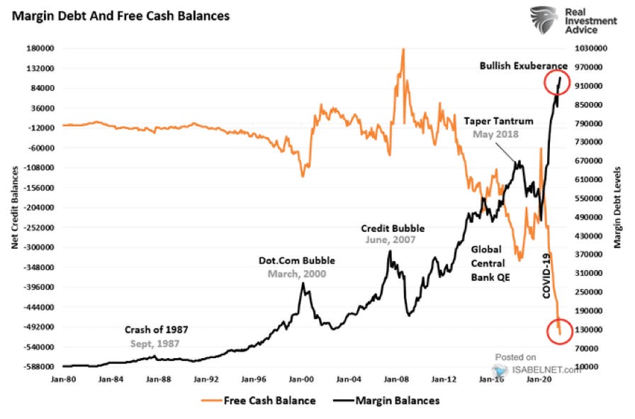
Margin Debt
Investors are borrowing more money for investments than ever before.
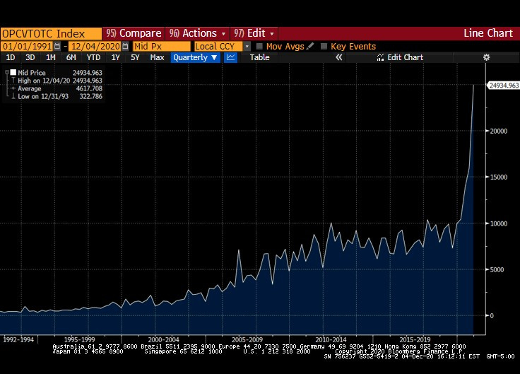
Call Option Volume
Investors are making short-term bullish bets at the highest level ever.
The danger here is interest rates. The dominant market valuation model since the financial collapse of 2009 has been the Fed Stock Valuation Model, which is the “theory of equity valuation that compares the stock market's forward earnings yield to the nominal yield on long-term government bonds, and that the stock market – as a whole – is fairly valued, when the one-year forward-looking I/B/E/S earnings yield equals the 10-year nominal Treasury yield.”5
Using the rate on the 10-year Treasury as a guide for stock valuations has been wonderful idea for bulls, as rates have approached the zero bound. Unfortunately, what goes up must come down, with inflation. This model will wreck stock returns until bonds find equilibrium and this is dependent on Federal Reserve policy and inflation.
An Afterthought - Gamestop
Gamestop (GME) is probably one of the easiest cases to study for an equity valuation that makes absolutely no sense and cannot be justified. If you simply looked at the chart below, you would think that Gamestop must have developed some revolutionary drug or technology that altered their business model.
A chart like this suggests that the company has a cure for COVID-19. Before the pandemic, this retailer was headed for bankruptcy. The long-term trend in gaming is not retail. Games like Fortnite are free, can be played on multiple consoles or PCs, by downloading them, and in app purchases drive revenue. Nothing about that drives Gamestop revenue.
In fact, Google offers a cloud gaming service. The future of gaming might be very hardware-light, especially after internet speeds increase to rural and underserved areas. Further, Amazon has ventured into gaming with their own MMORPG. These trends are not favorable to a game retailer. Gamestop is simply a middle man and if these giants can cut them out, they will. EVERYTHING about the gaming world says the old retail business model is dead.
I did read the annual report. A bright note for the company is that 29% of the companies sales in 2020 were online, increasing from single digits.6 However, CEO George Sherman’s letter to shareholders mentioned four strategic initiatives, none of which would justify the expansion of the stock price, as they are all simply a transition from retailer to online retailer, i.e. direct competitor with Amazon.com.
The company pretty much agrees that the stock price is unjustified with this note in the annual report.
I rest my case.
Maybe one day I will try to figure out what Gamestop is worth, but it has no earnings. A price to sales ratio is a place to start, but with the P/S ratio being 2.76, it is still twice the value of the sector median at 1.30 and if you believe equity valuations are stretch, there’s not much point in wasting the time.
Market Cap to GDP, https://www.longtermtrends.net/market-cap-to-gdp-the-buffett-indicator/
Mastering the Market Cycle, Howard Marks
The McClellan Oscillator & Summation Index, https://www.mcoscillator.com/learning_center/kb/mcclellan_oscillator/the_mcclellan_oscillator_summation_index/
S&P 500 PE Ratio, https://www.multpl.com/s-p-500-pe-ratio
Fed Stock Valuation Model, https://en.wikipedia.org/wiki/Fed_model
Gamestop 2020 Annual Report, https://news.gamestop.com/static-files/470c5a4c-bb4f-48d4-abec-befd467d3210


